Description
This website was built for WhiteCastle by Zimmerman Advertising and serves as the main brand experience. It was my responsibility to setup and develop the front-end components including all HTML, TypeScript (JavaScript) and Less (CSS). Additional responsibilities included the creation of several backend components and ensuring proper integration with APIs and Services setup by other team members. Portions of the front-end side were constructed by other team members however I was responsible for verifying all aspects and ensuring work conformed to previously constructed project structures.
Introduction
WhiteCastle by nature is very socially engaged with their customers, referred to as Cravers and even created a completely UGC (User Generated Content) driven web presence known as CraverNation. While a success it was often difficult to drive traffic to a different website and needing to maintain updates between two websites running two completely different architectures became difficult to manage. With the new WhiteCastle 2.0 we have completely streamlined the interaction between those who have been Cravers for years and those discovering WhiteCastle for the first time.
Technologies
Typical websites are executed on a per page basis requiring a full reload of all assets including HTML, CSS, JavaScript, Images, and reprocessing of backend or server side code to generate page and url structures. Utilizing an advanced technologies such as AngularJS provides a framework for building sites that reduce server load while also creating seamless user experiences that work on all devices and platforms.
AngularJS
Created by Google and maintained by the open source community AngularJS is a lightning fast MVC (Model View Controller) framework written in JavaScript and executed in the browser. AngularJS provides the foundation for creating highly scalable single page applications that are easy to maintain by separating business logic known as controllers and presentation known as views.
TypeScript
An open source project created by Microsoft provides classes, models, type checking and compiles into plain JavasScript that is readable by any browser. TypeScript in Visual Studio gives you full intellisense and bundles easily into a single file reducing requests and load time of the overall website.
Less
The saying goes that “Less is more”, never has this been more true here with Less. This powerful syntax provides nested CSS eliminating the need to remember and maintain long and often complex selectors. Built in functions known as mixins and variables allow you to declare something once and reuse it many times later.
Home Page
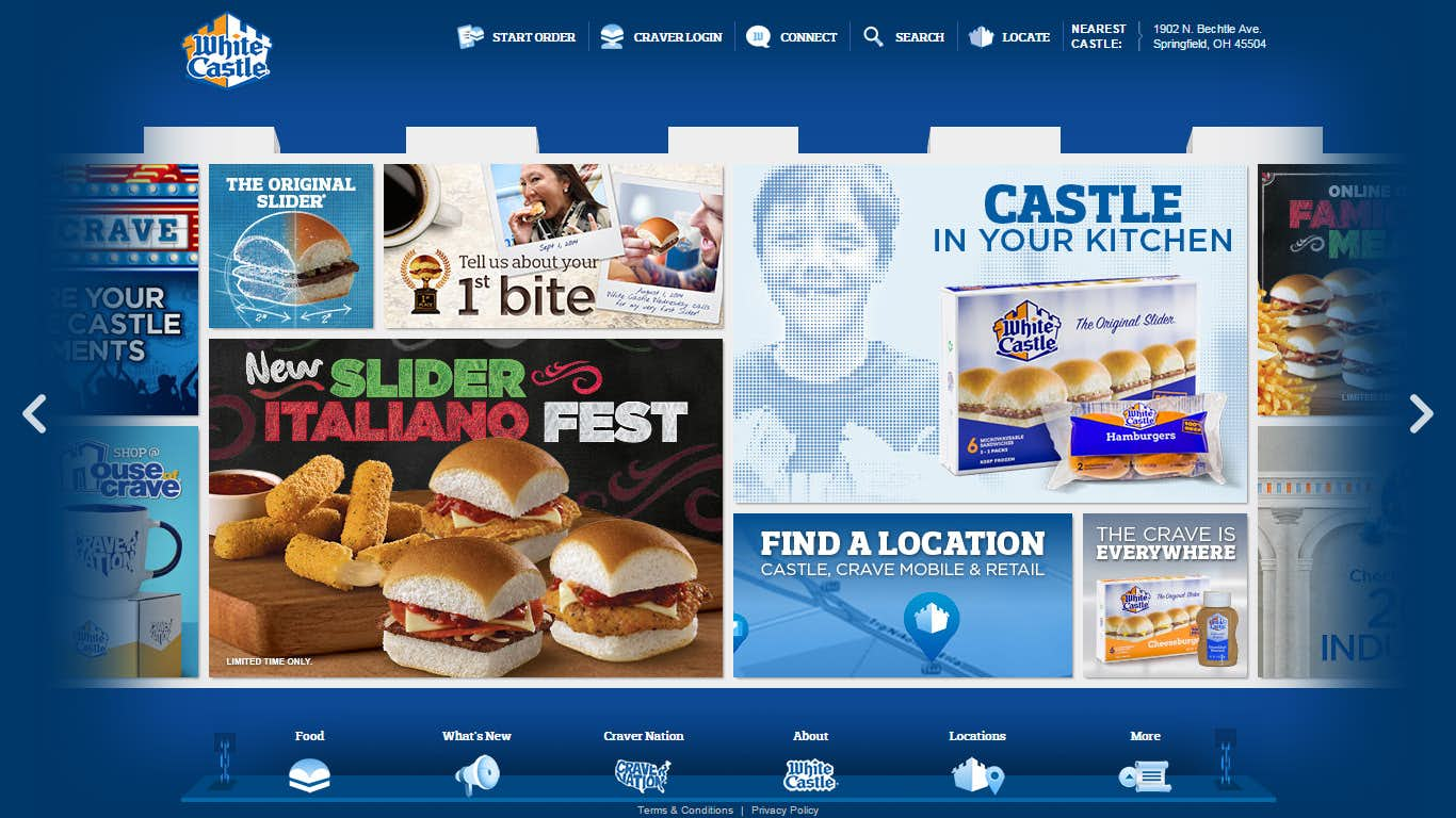
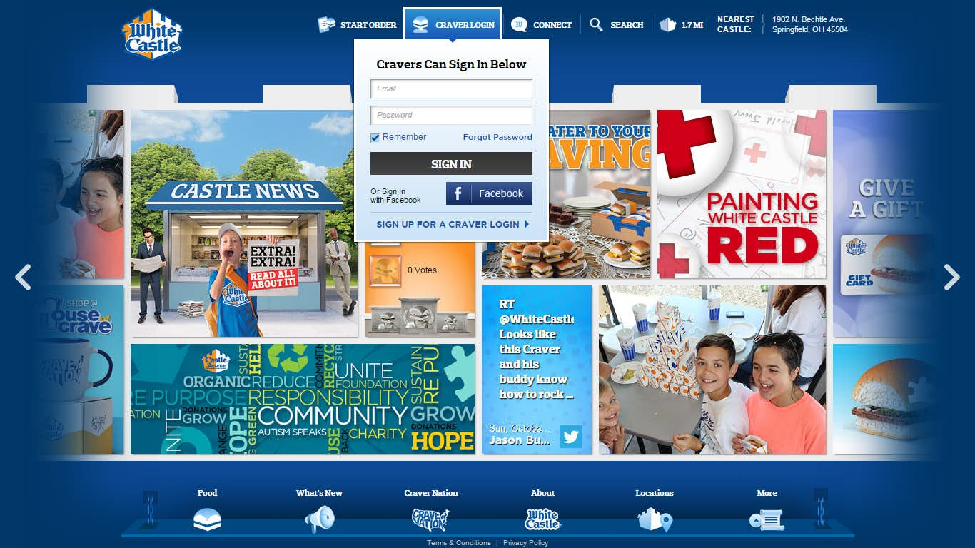
Users visiting whitecastle.com for the first time are presented with a small intro featuring the WhiteCastle logo that rotates to reveal that it is actually a 3 dimensional object. Once rotated about 180 degrees the cube starts to unfold itself into the Wall and becomes the main navigation and discovery experience for the entire site.
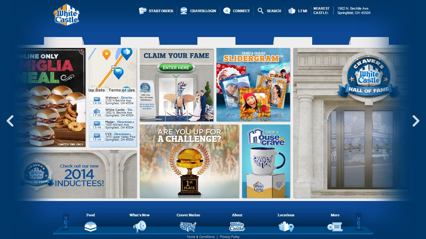
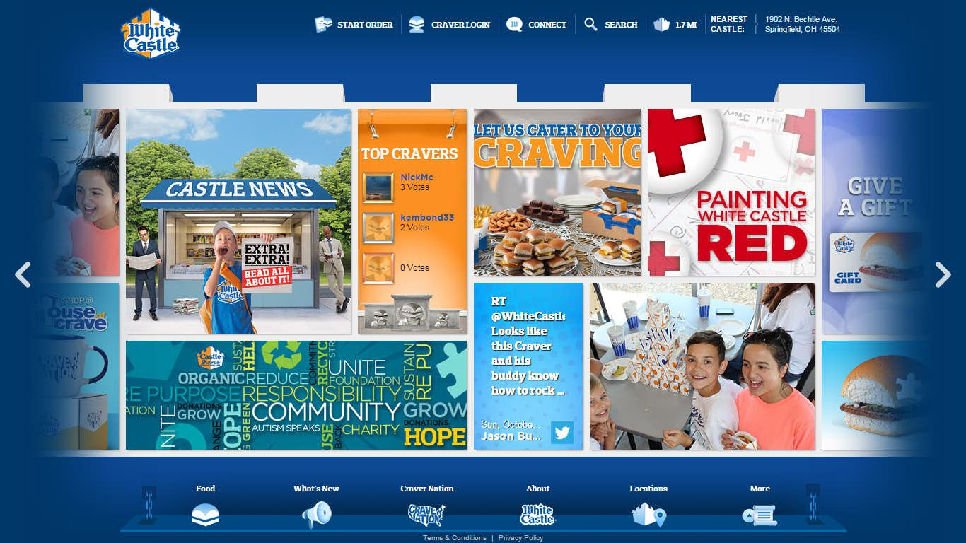
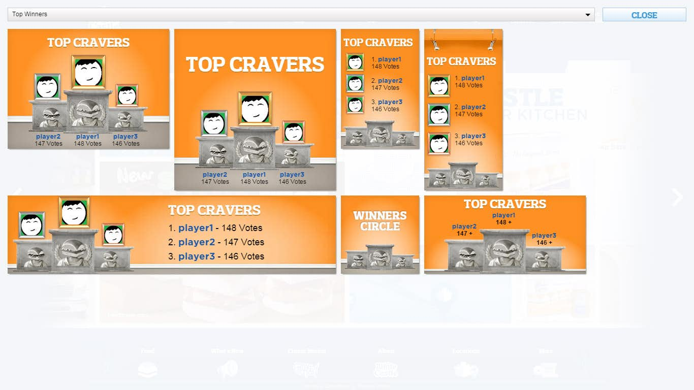
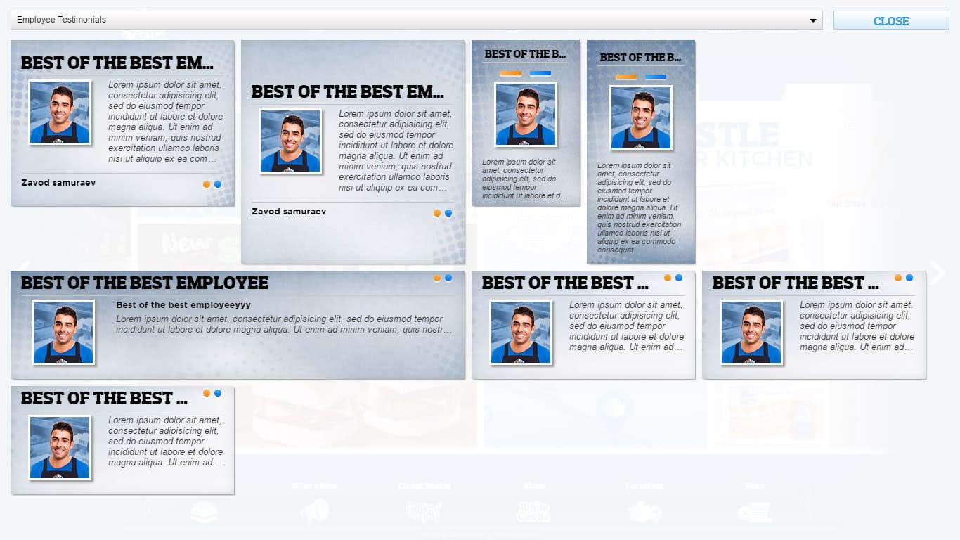
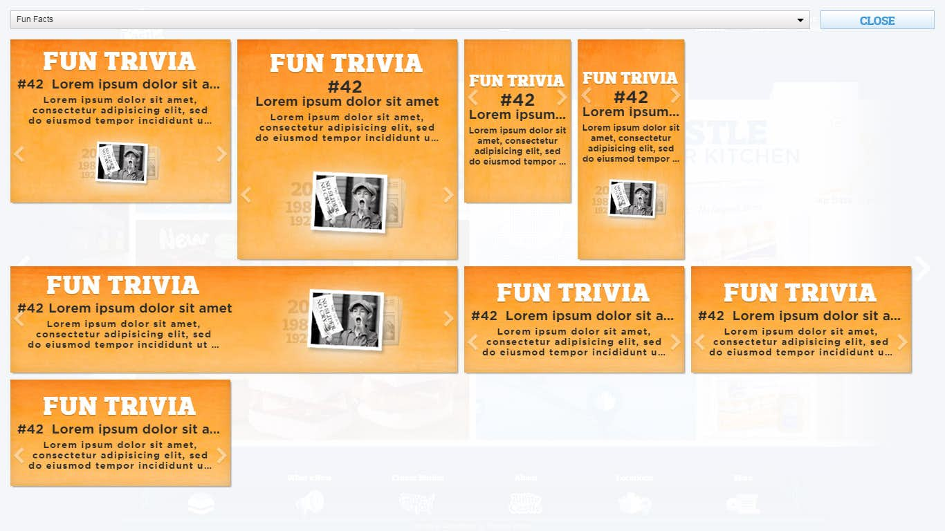
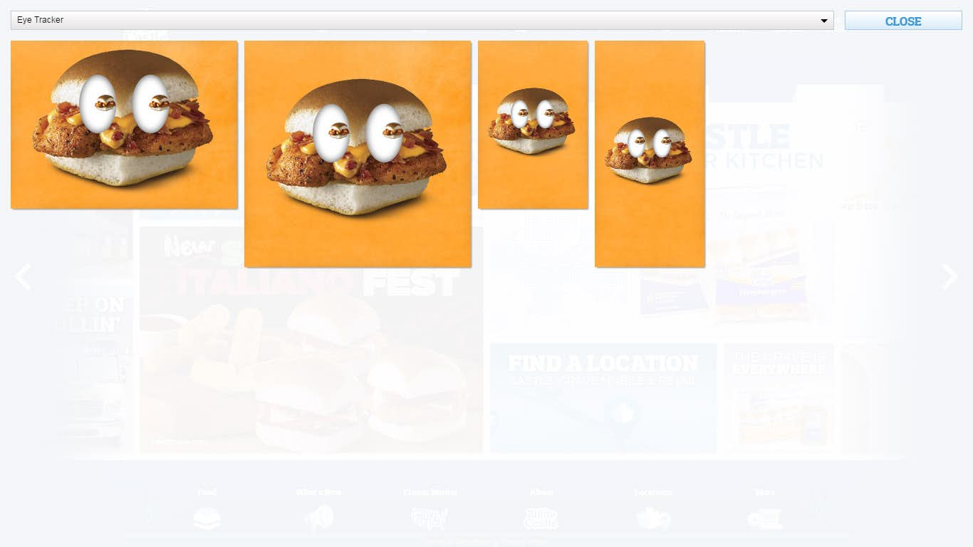
With the Wall unfolded users can scroll left or right using the mouse or by touch and drag on mobile devices such as the iPad. The Wall is is built of different types of panels featuring various layouts and Tiles that fit into those panels. These Tiles are responsive and will resize, crop, or even load in different assets based on the size of the browser.
Tiles are loaded infinitely from either side with a piece of code that removes panels from the opposing side to allow those Tiles to fall back into the pool and to reduce the amount of memory in use by the site at any given time.
Mobile
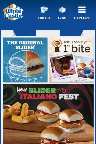
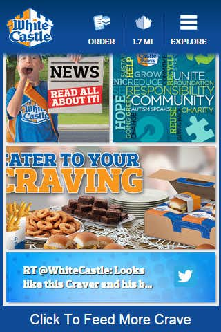
The mobile version of the Wall takes on an entirely new mechanic switching from a horizontal to a vertical experience. This allows the site to function using the more natural and hardware accelerated scroll of mobile devices. By default the mobile Wall is limited to an arbitrary amount of panels and users may load more content by tapping a link at the bottom of the Wall.
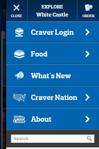
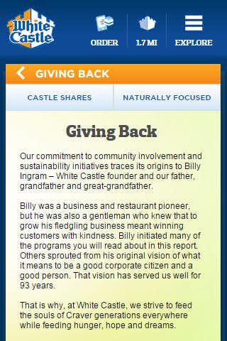
Mobile sites typically condense the navigation into a vertical style list and many will also go the extra mile of having the menu pop out from the site. The mobile menu for this site features menu items but also several functional sections detailed in the Utilities section below.
Utilities
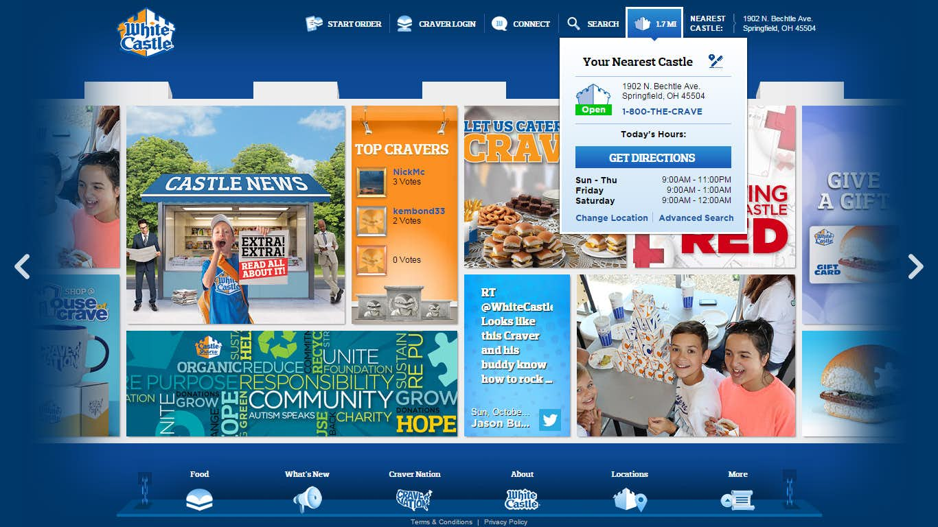
Many of the sites core features can be accessed or viewed in summary using the various Utilities in the top navigation section. These provide quick access to items like the users profile and the ability to locate the nearest WhiteCastle.
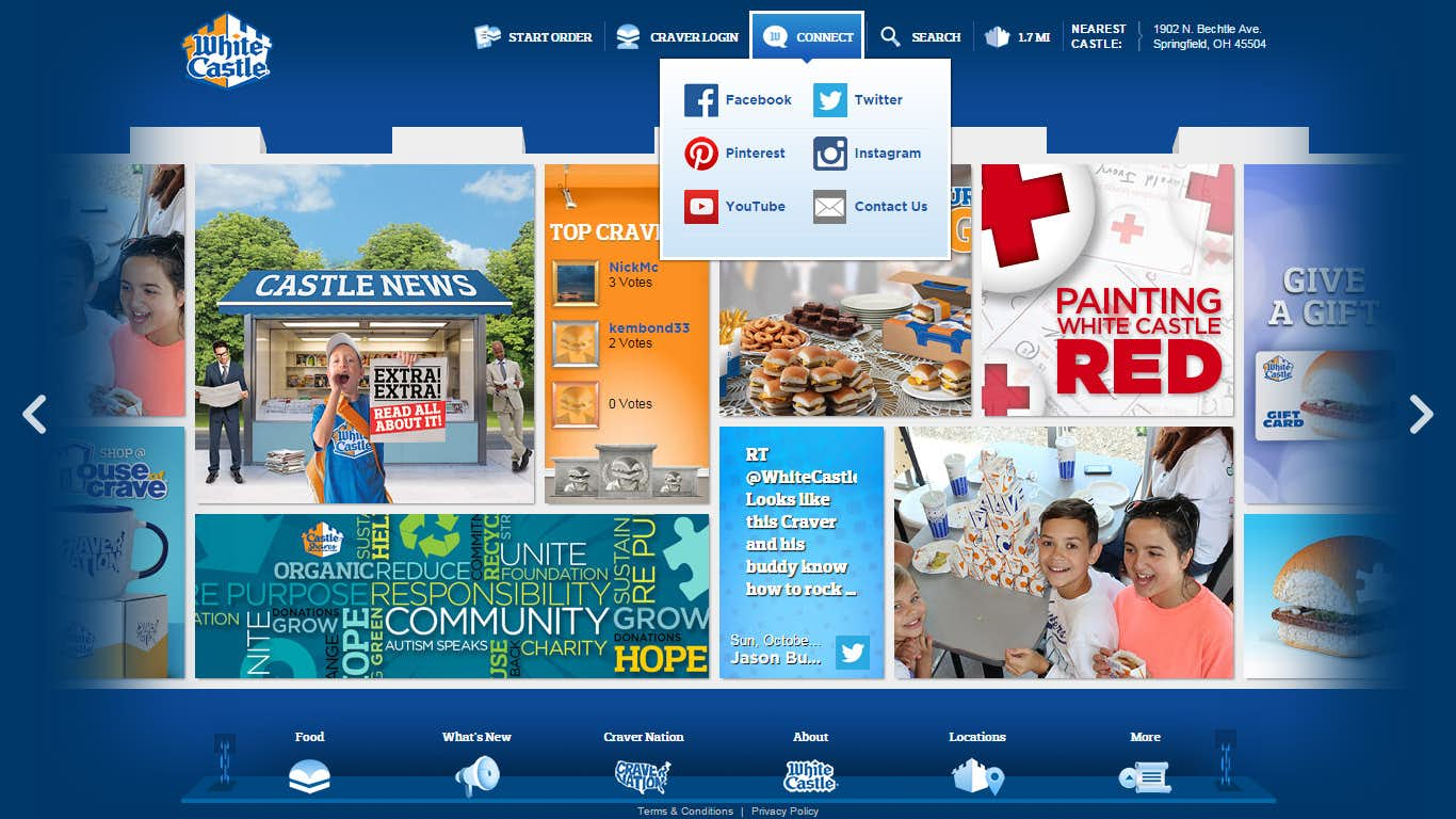
Having integrated CraverNation into the new site this also meant a new style of login and profiles as well. Users can sign in using social media or create an account directly on the site. This provides access to features such as challenges and other activities within the site. An additional simple menu lets users access the various social platforms that are managed by WhiteCastle.
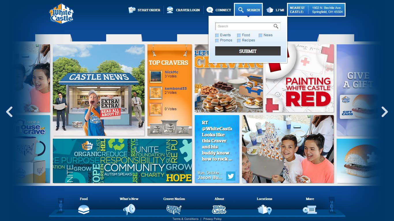
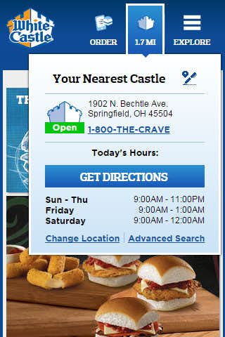
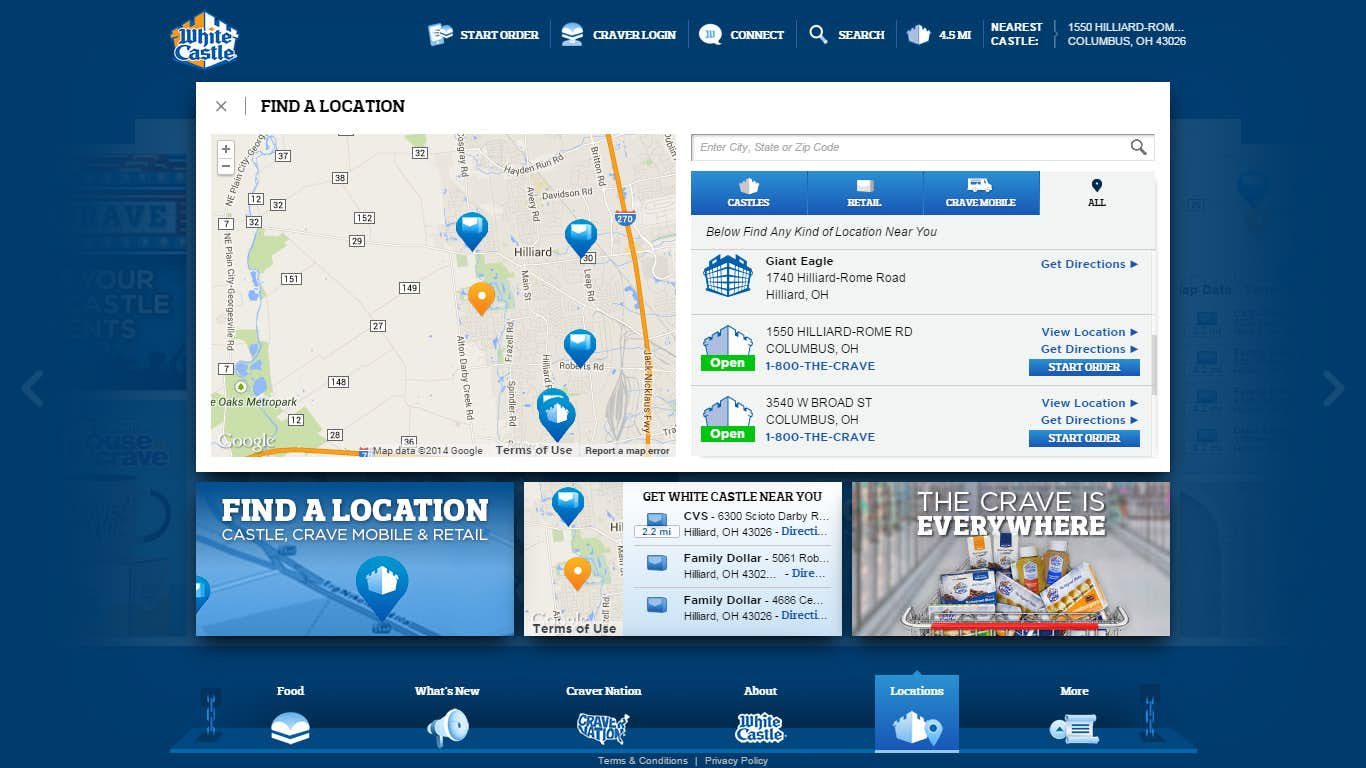
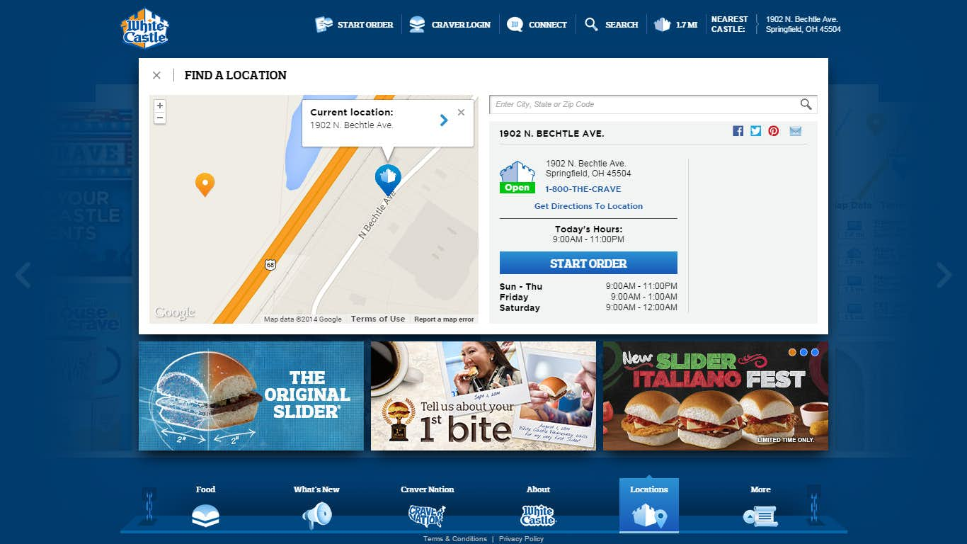
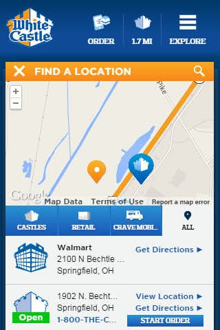
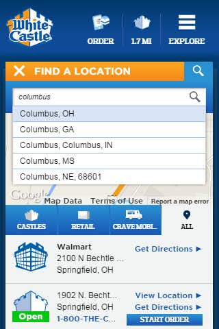
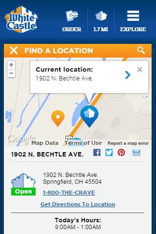
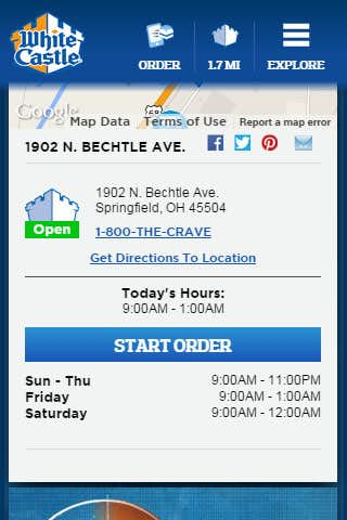
Everything in the site is tagged and searchable through a single interface letting users quickly find their favorite Recipes or view News and Events that are relevant to them. The store locator icon features the actual driving distance to the nearest location using either IP based locations services by default or the exact position provided by GPS or compatible browsers.
Mobile
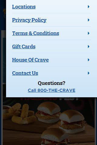
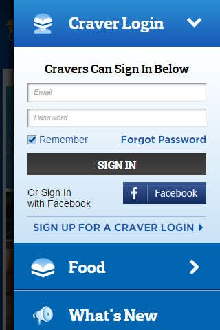
Most of the Utilities live inside the mobile navigation menu and allows for a shared design for items such as the Craver Login and Social Connect utility. These items expand and collapse to reduce the amount of scrolling the user will need to find the item or component they are looking for.
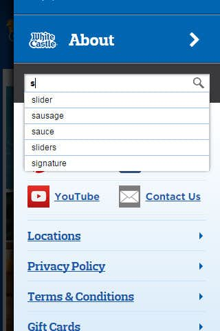
The store locator is important enough to maintain its own icon at all times in the top navigation bar this also means mobile users will have access to the single most used component letting them satisfy that late night Craving. Other items such as the social and search features are streamlined into the overall menu as smaller yet still easy to use sections. Predictive search means less time spent typing and a more enjoyable user experience.
Food Experience
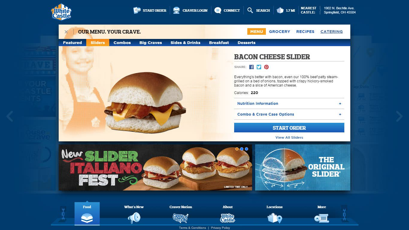
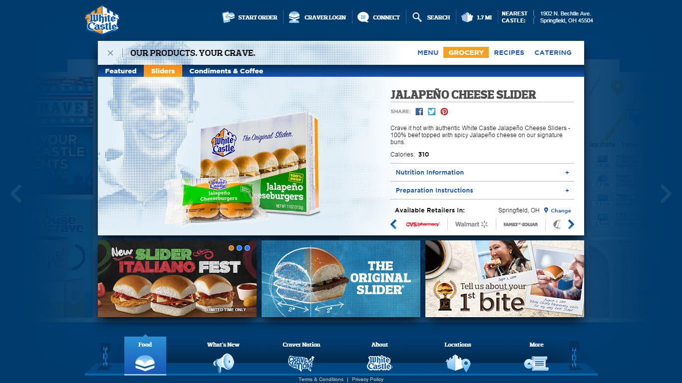
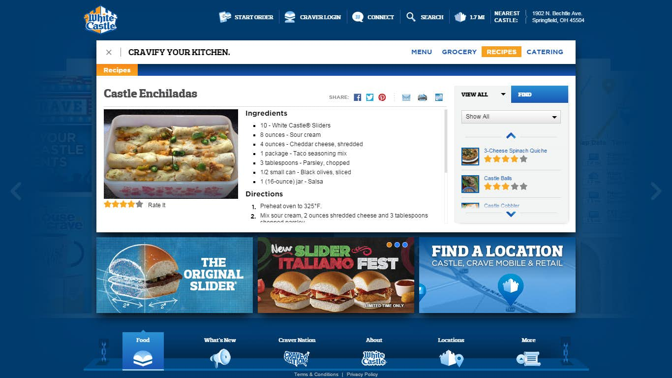
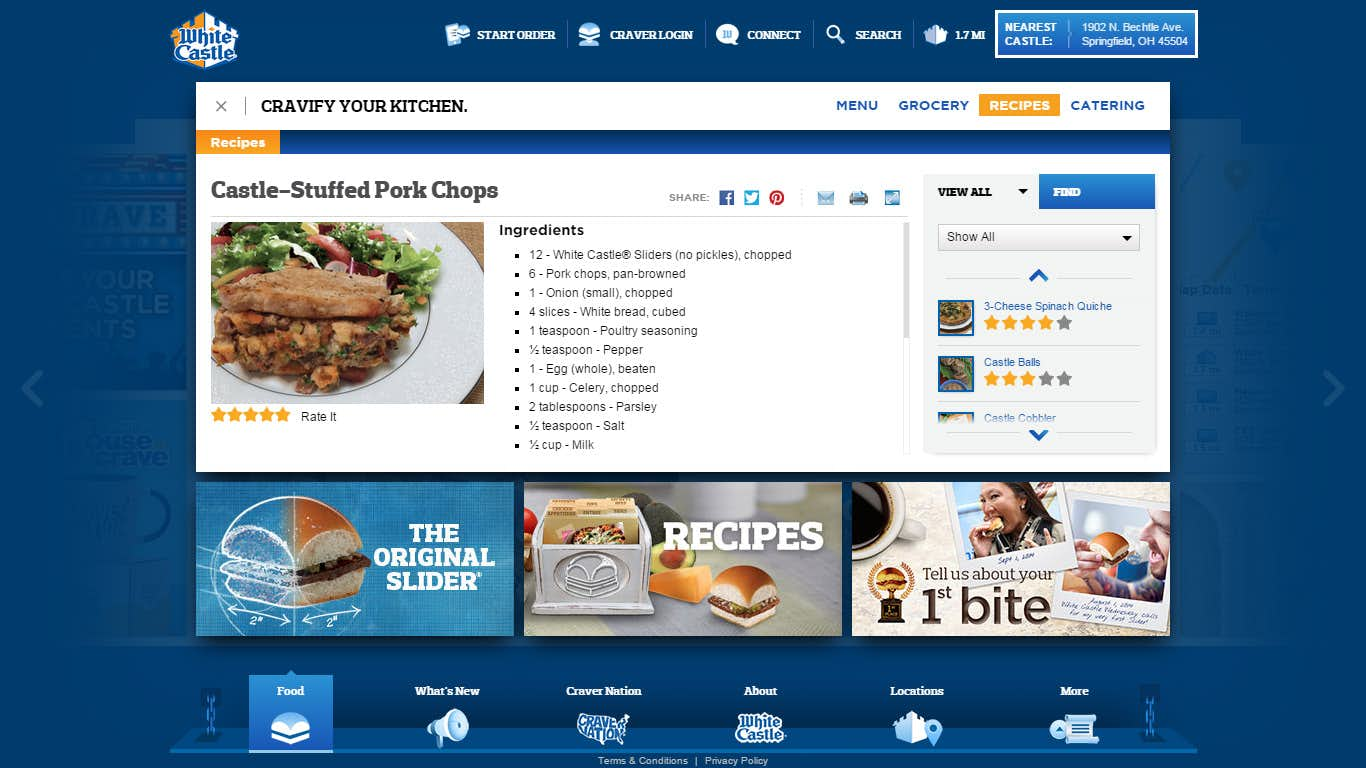
The Food Experience provides the main means by which users can find out more about WhiteCastles core products and menu offerings. An important push was to prominently display products that can be purchased in stores such as frozen Sliders as well as show the numerous Recipes submitted by users over the years that feature WhiteCastle products as ingredients.
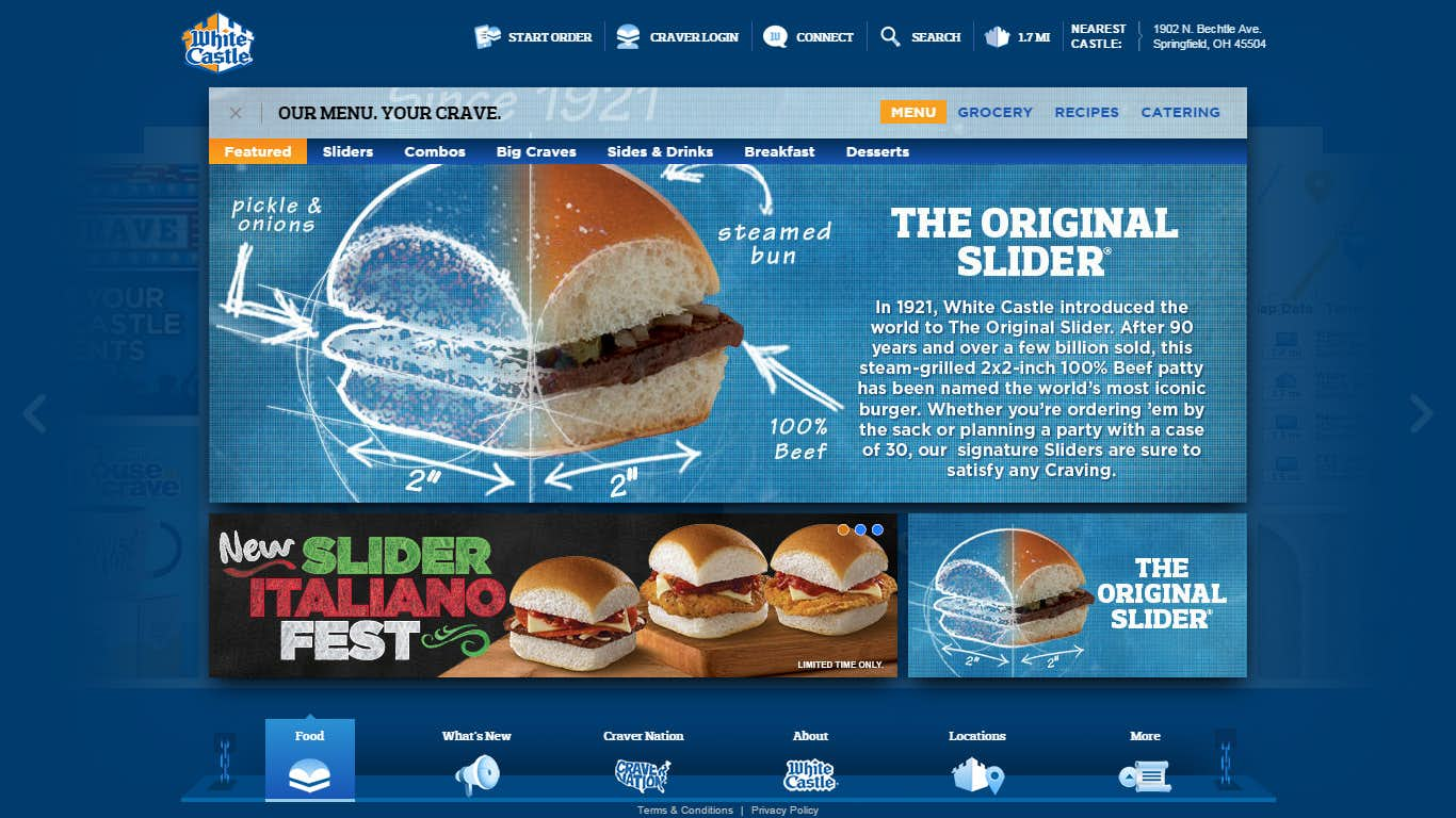
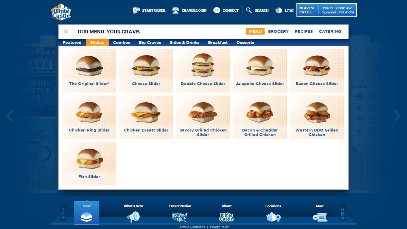
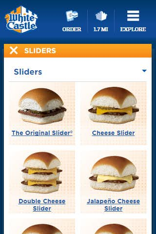
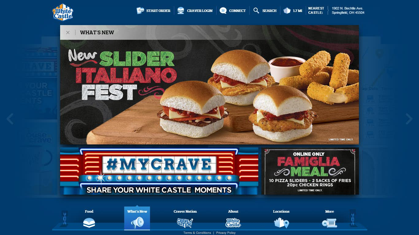
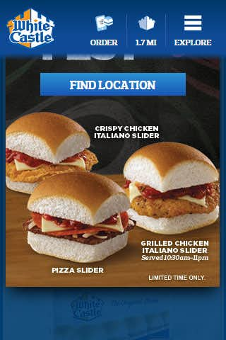
The very first page of the Food Experience is a miniature promotion type page that allows WhiteCastle to feature an item or special that they have going on in stores. Clicking any of the menu items such as Sliders or Desserts brings the user to a grid type page that features a thumbnail view of each item in that section and it’s title.
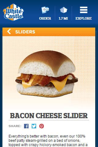
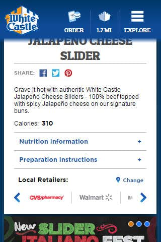
Viewing an individual selection shows a much larger view of the food item or product as well as other nutritional and promotional information. When viewing products found in retail stores the page provides a sliding list of the various stores where that product can be found. Clicking on a store name will direct the user to the location that is closes to the user. Users can also share their favorite items with friends on social media.
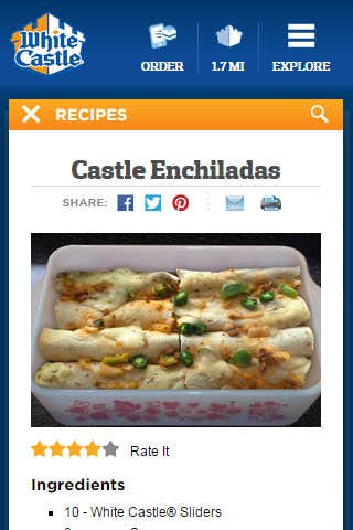
The Recipes section in addition to having search and filter capabilities also lets users print out the page in a stripped down printer friendly version that won’t use a lot of color ink. Recipes can also be emailed to friends and rated so that over time the most popular recipes are displayed first.
Mobile
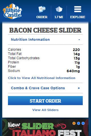
Mobile view allows most content to naturally flow downward with items such as the grid view adjusting in size and amount of items per row. Food item pages feature the item image large and upfront to get the user interested in trying that particular product.
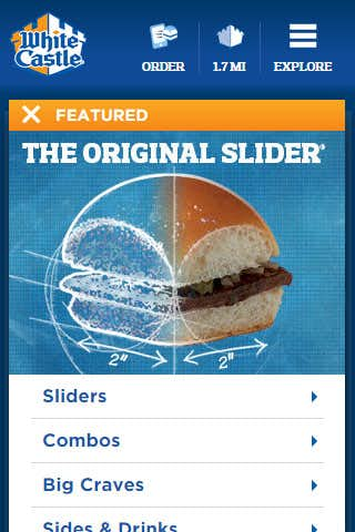
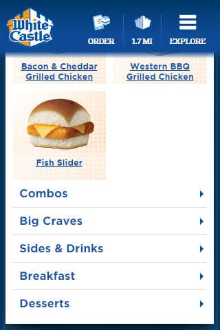
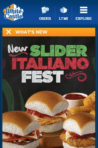
The featured page transforms into a smaller promotional image with the various categories such as Sliders and Combos listed underneath. When clicking any category the items for that category are loaded underneath and brought to the top of the page.
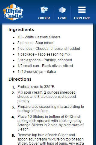
Designing sections such as the informational tabs on the desktop view allows an easy translation to desktop and provides a clean interface to get the most useful information. Recipes show a stacked view of the ingredients and directions which is great when shopping for your next WhiteCastle infused meal.
Promotions Experience
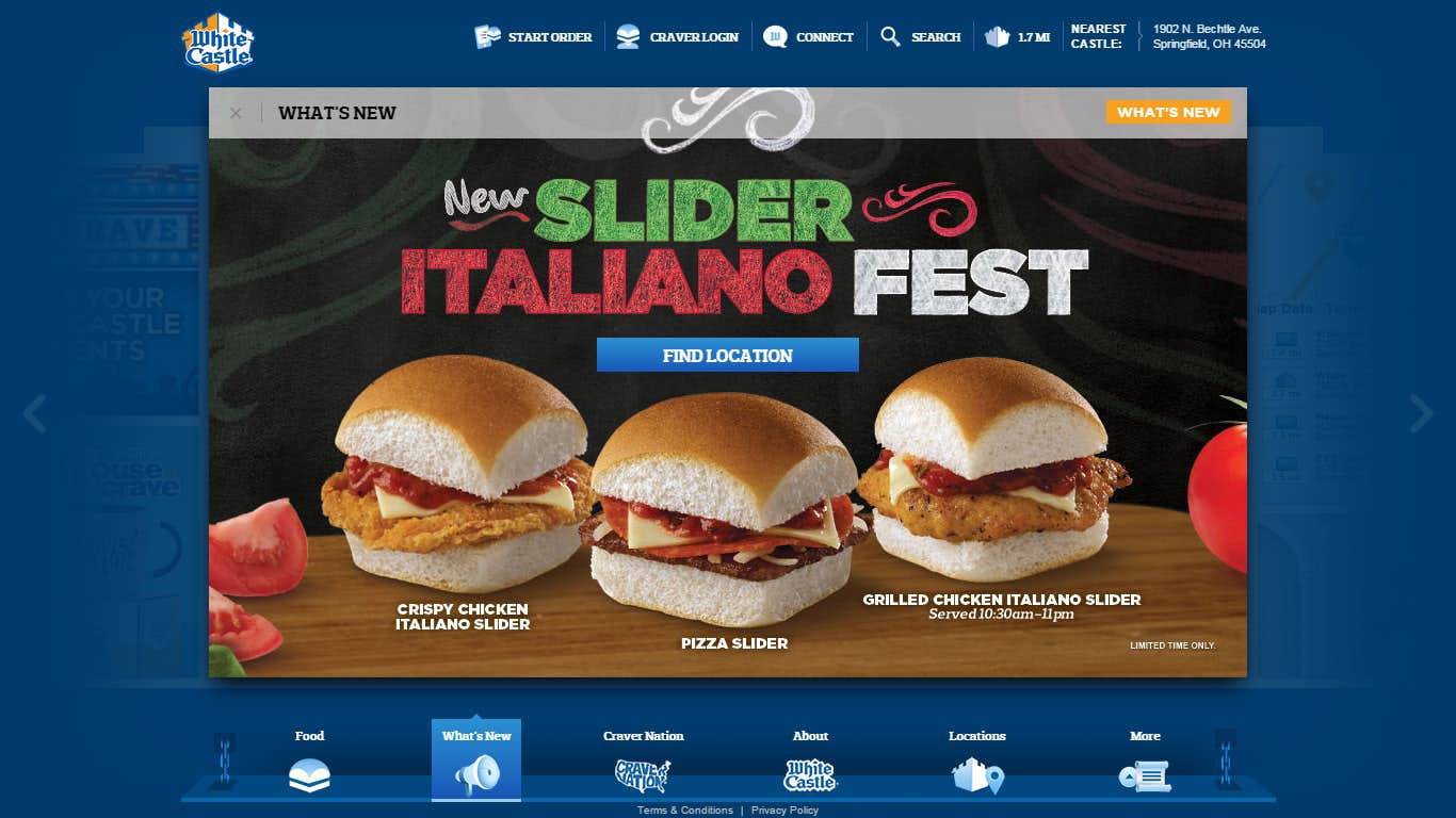
This section is home to all promotional offers and campaigns being run and allows a quick turn around time for creating new pages as they are mostly a single image featuring a single CTA (Call To Action) button.
These pages can feature simple items such as buttons or utilize more complex HTML and CSS that can be customized in the Admin area. Various buttons can be used such as ones that execute internal site functions or ones that link out to a particular page.
Mobile
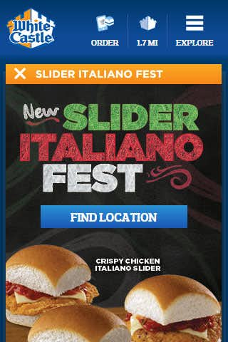
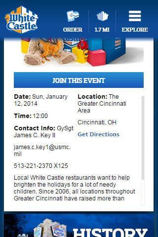
Promotions are featured as either pages that feature Tiles or ones that do not. Pages without tiles provide a larger area for creative assets or functional items.
CraverNation
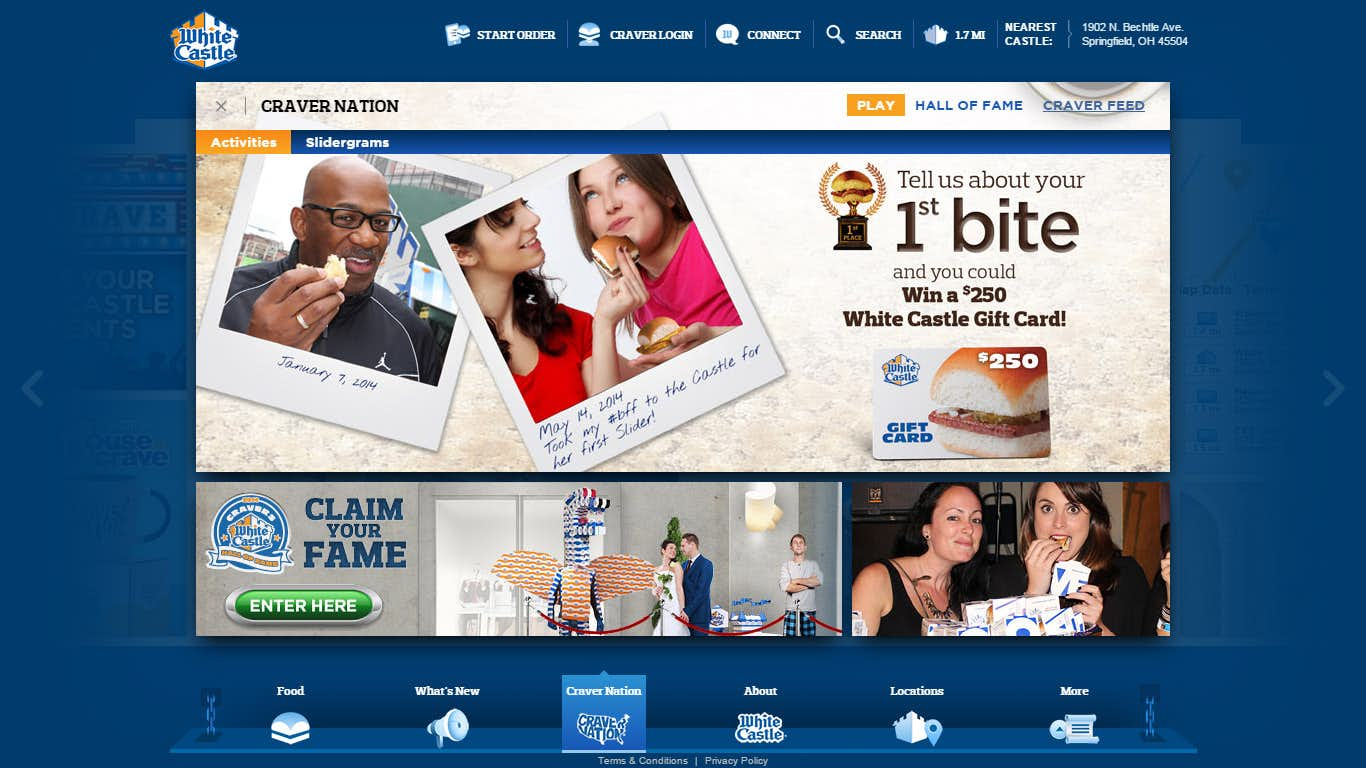
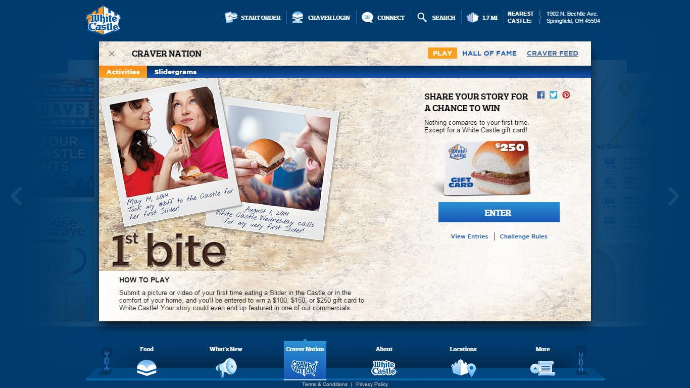
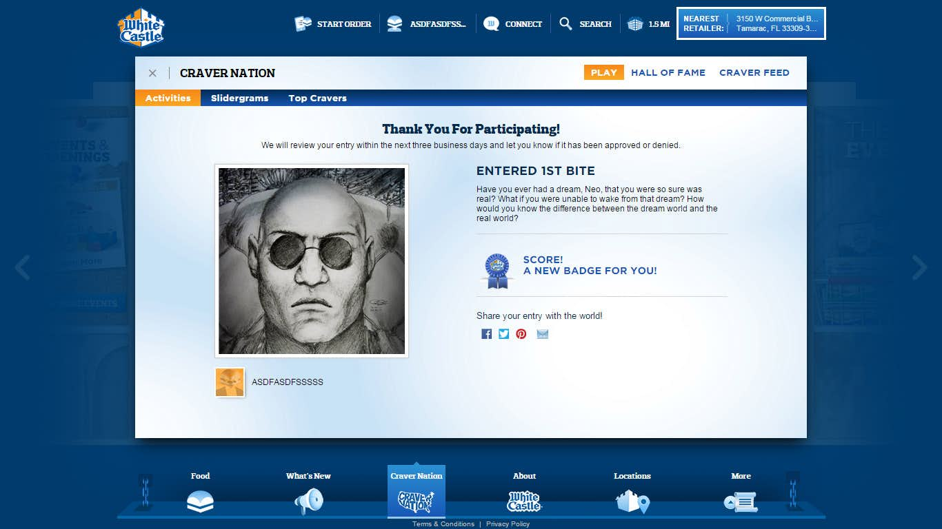
CraverNation has been integrated into the new WhiteCastle site as its own experience and lets users interact with others by competing in various challenges and activities. Challenge entries are placed in the Admin area for approval and can show up as content on various Tiles and other sections of the site as UGC.
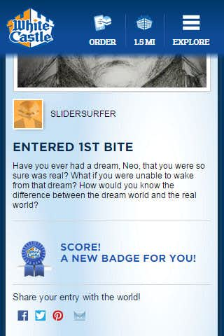
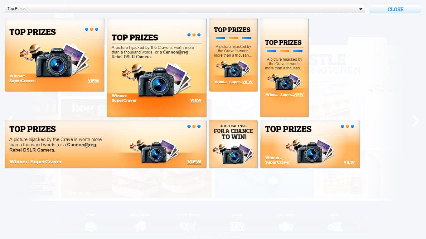
Challenges only need a handful of assets to deploy and creates a structured way to implement and users can earn new trophies and badges for participation and for placing in first, second, or third in a challenge. Prizes are also often offered as an incentive to compete.
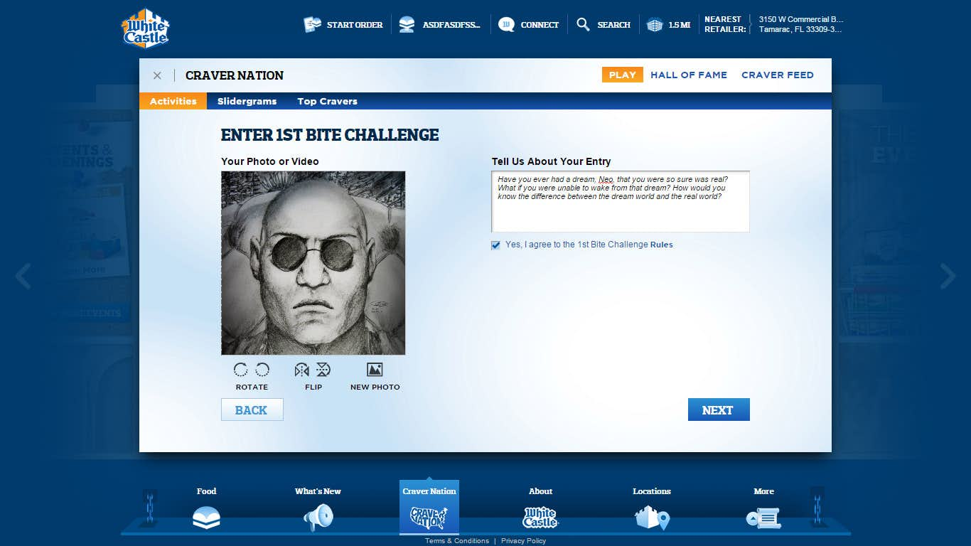
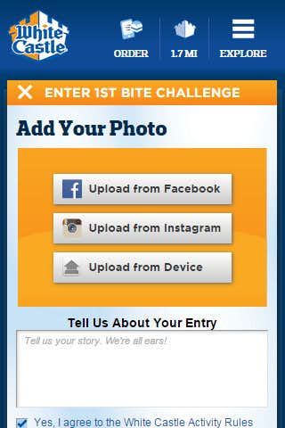
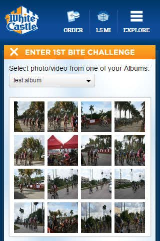
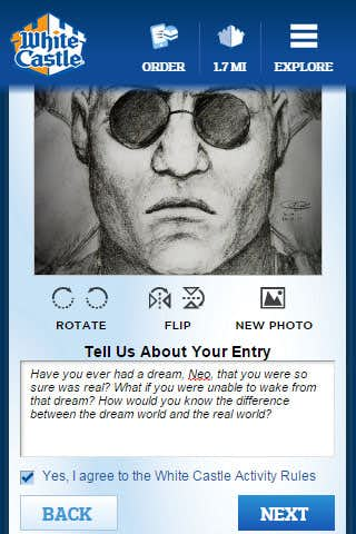
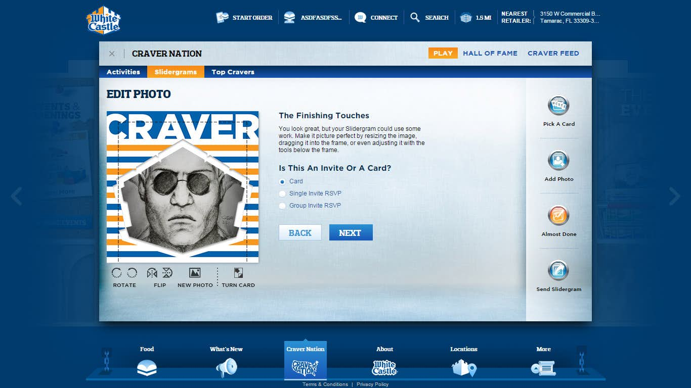
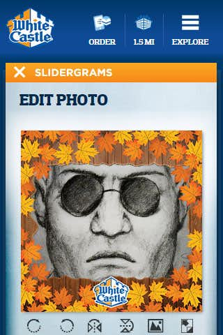
The challenge entry process allows users to upload their own pictures or videos from either their local computer or device, or by using one of the social connect options such as Facebook or Instagram. Once uploaded the photo can be manipulated to fit the frame by resizing, cropping, flipping, and even rotating. This component uses the HTML5 canvas element in browsers with proper support or by using traditional DOM elements in older browsers.
Mobile
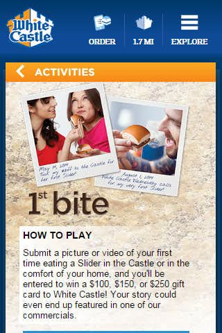
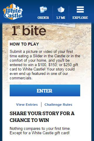
Challenges on mobile carry over all of the functionality of the desktop portion with slight transformations.
Most platforms now support the ability to upload images directly from the device making it easier for users to snap a quick picture or video and then upload it as part of a challenge.
The photo editor provides touch based controls when viewed on a mobile platform allowing the same type of options as on the desktop counterpart meaning mobile users are no less able to actively compete in challenges and activities on the site.
Slidergram
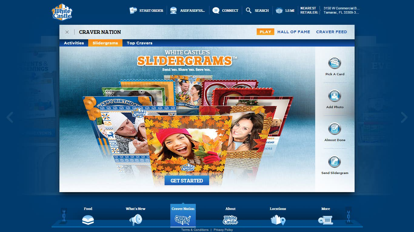
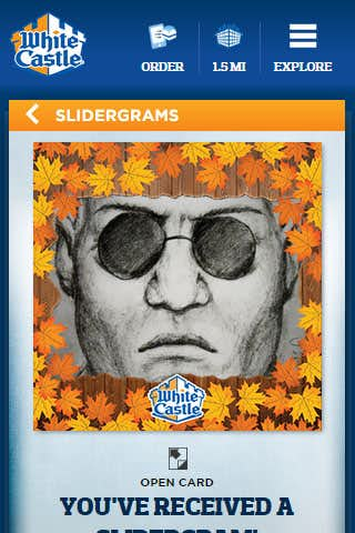
WhiteCastle started kicked off Slidergram as a speciality card and RSVP tracking system for their annual Valentines Day event. Slidergram was so popular that now it is used year-round with the ability for WhiteCastle to easily swap out cards, templates, and themes for each seasonal or initiative change.
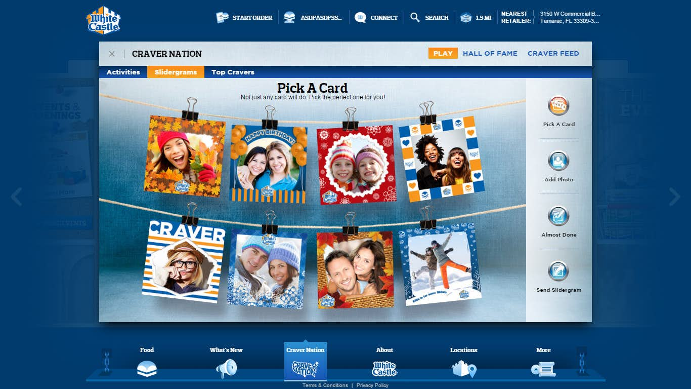
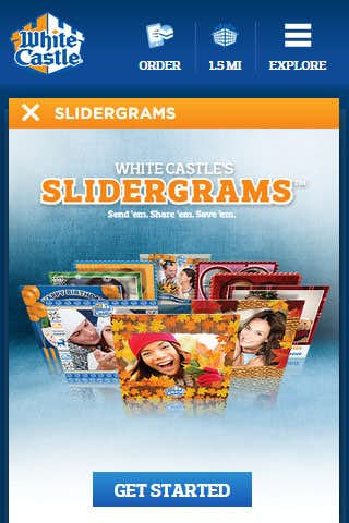
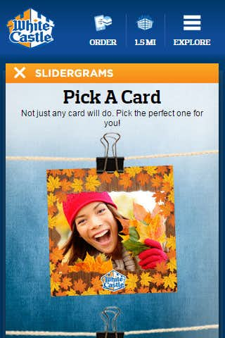
The intro pages provide a promotion type page with a catchy CTA image and the Get Started button. Once clicked the user gets to see all the cards, hanging from a couple of ropes. A bit of CSS3 transforms lets us give the cards a subtle sway effect as if they were caught in the wind. Using Less comes into play here by using mixins that automatically generate the CSS3 transform syntaxes for each browser.
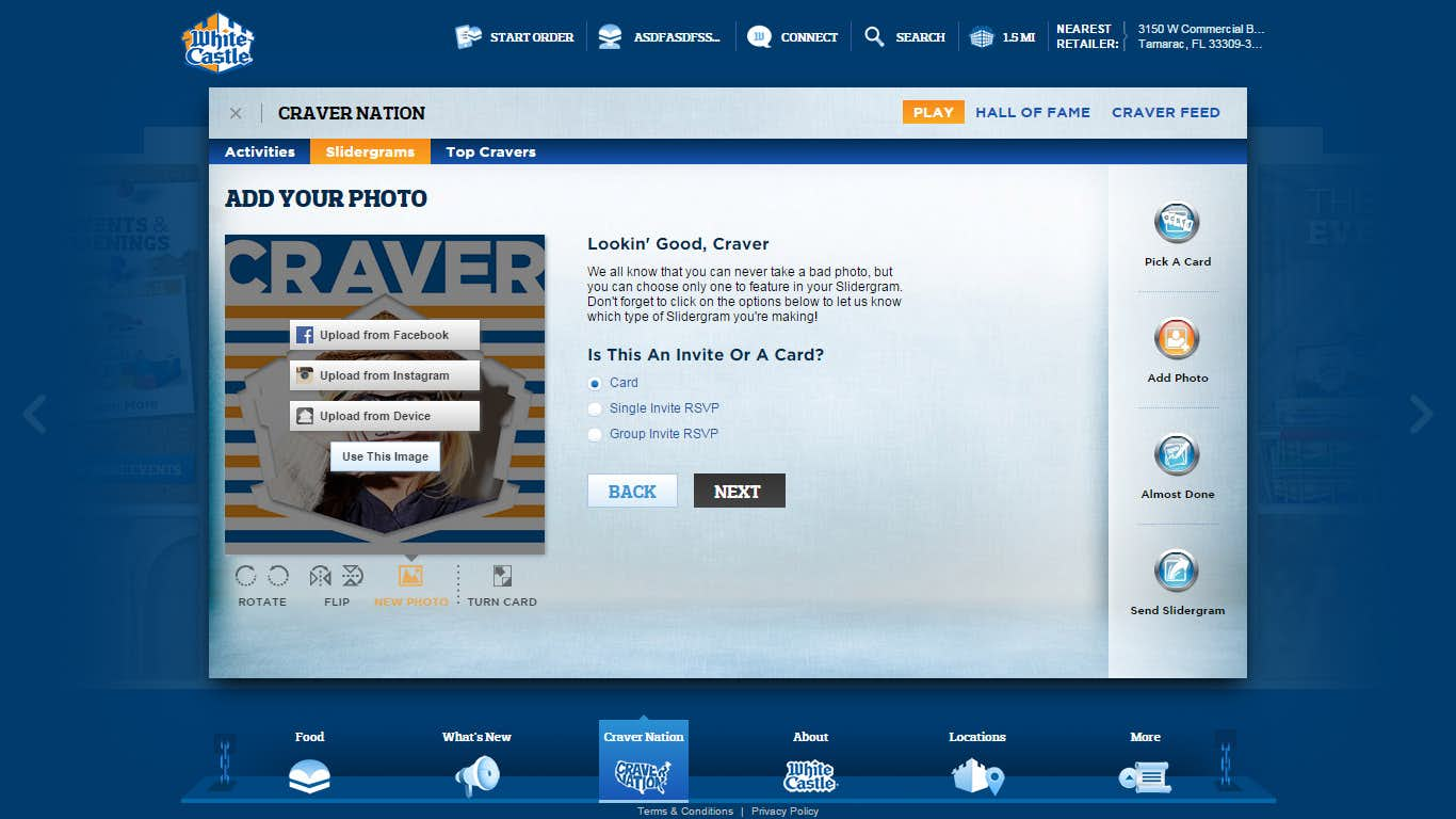
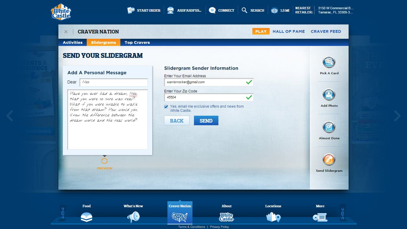
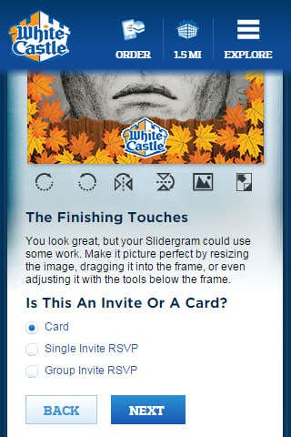
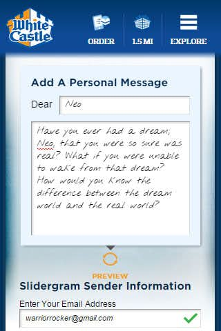
Similar to Challenges the Slidergram process allows the user to upload their own image. The added touch with Slidergram is generally there is also a secondary movable element such as a Slider, Cupid, or Antlers. These add extra flair to the customizable card which also include a message on the rear side. The card flips using a bit of CSS3 or fades in legacy browsers.
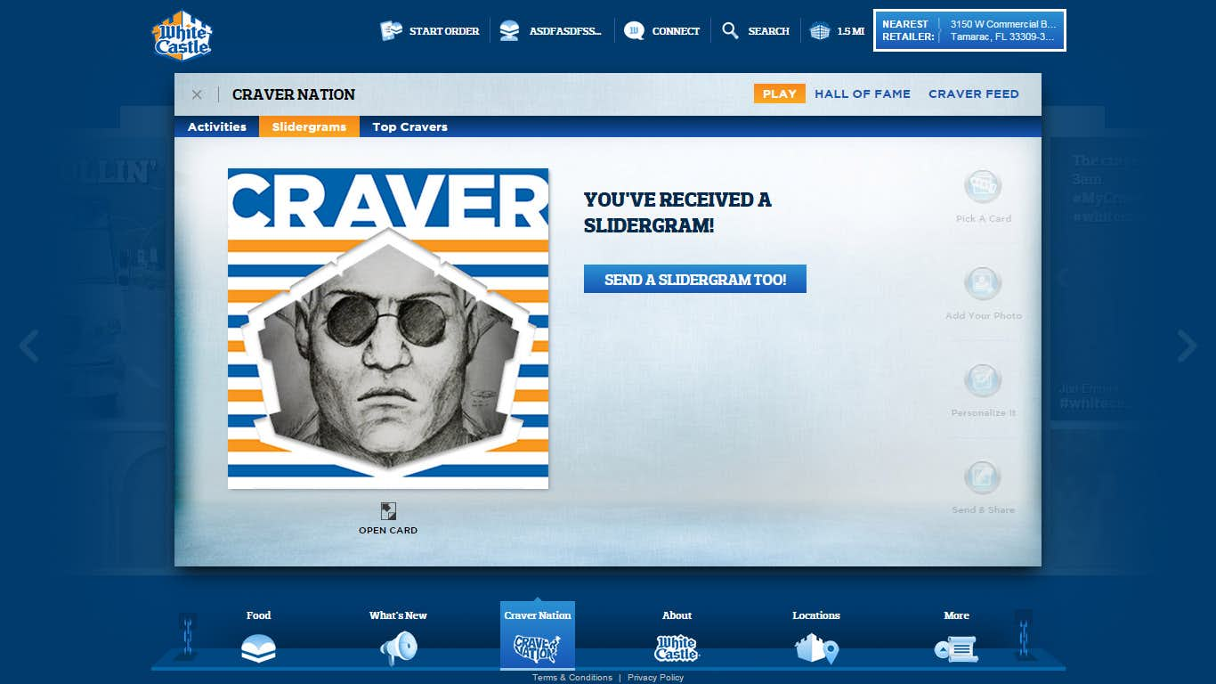
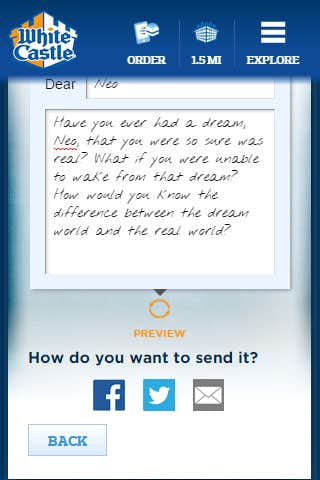
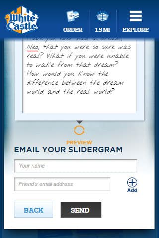
The card can be shared on various social platform and even sent using email to several recipients. Once sent a Slidergram card the recipient of the card can RSVP depending on the type of card chosen by the sender or create their own card.
Mobile
Like Challenges the mobile version of Slidergram gives users access to the full capabilities of the photo editor while still being slim and efficient enough for mobile platforms.
Hall of Fame
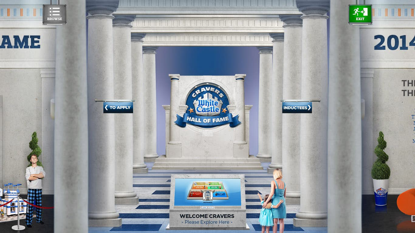
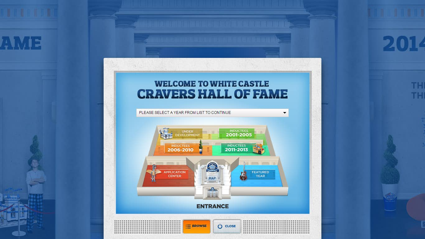
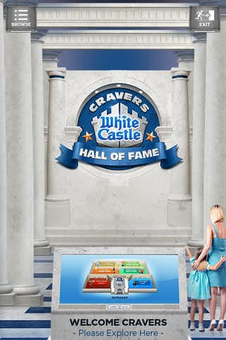
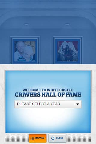
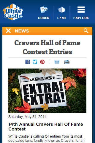
Over the years WhiteCastle has honored various individuals and groups that have performed Craver Hall of Fame worthy acts. With the new new site WhiteCastle wanted to bring their physical Hall of Fame to the web in an immersive experience that really does the Hall of Fame justice.
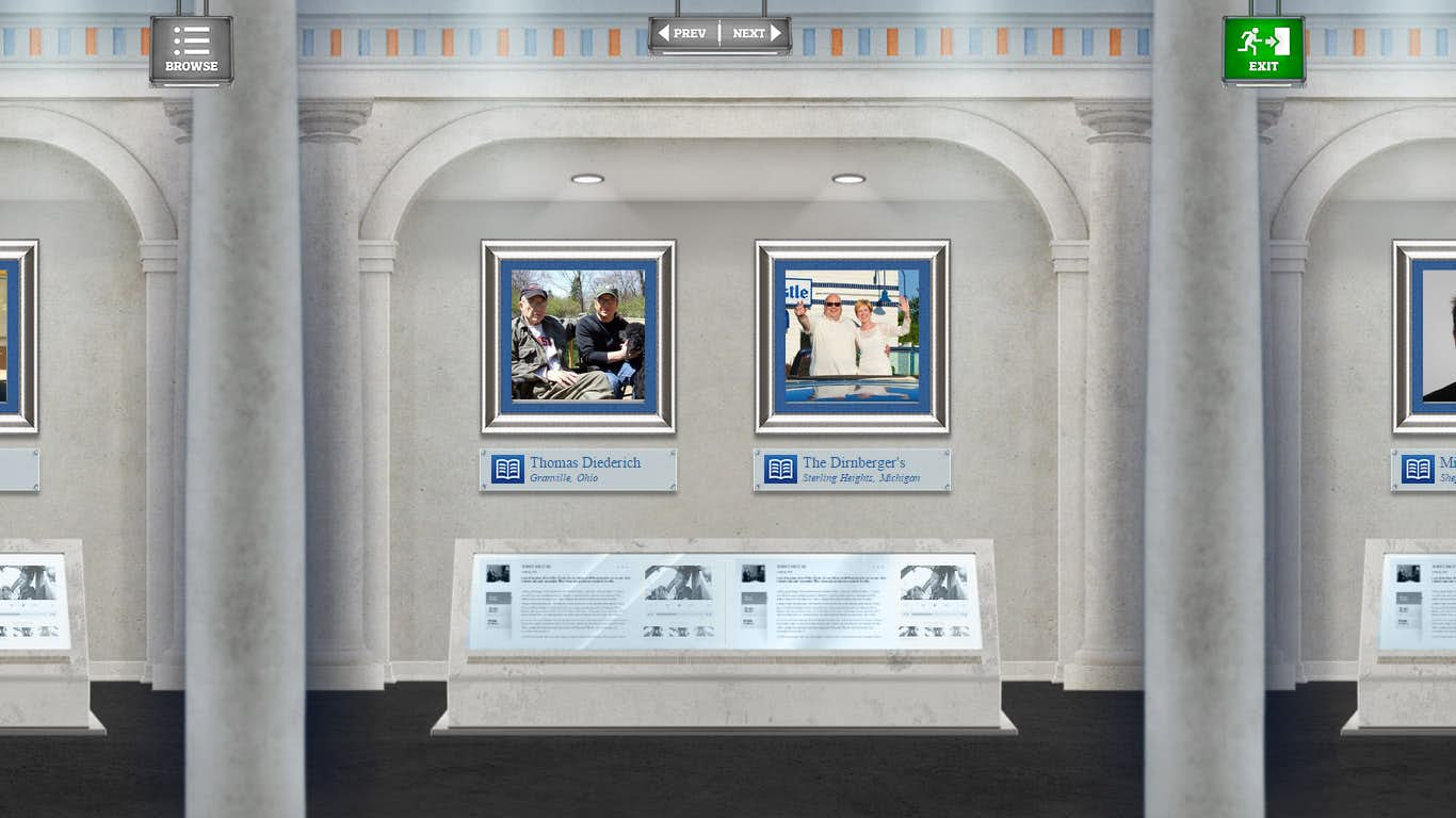
Scrolling left and right users are able to virtually walk through the Hall of Fame and explore the various inductee sections. This is a full parallax experience, known as the effect of multiple layers moving at different rates creating a 3D perspective effect such that objects move relative to your current viewing angle.
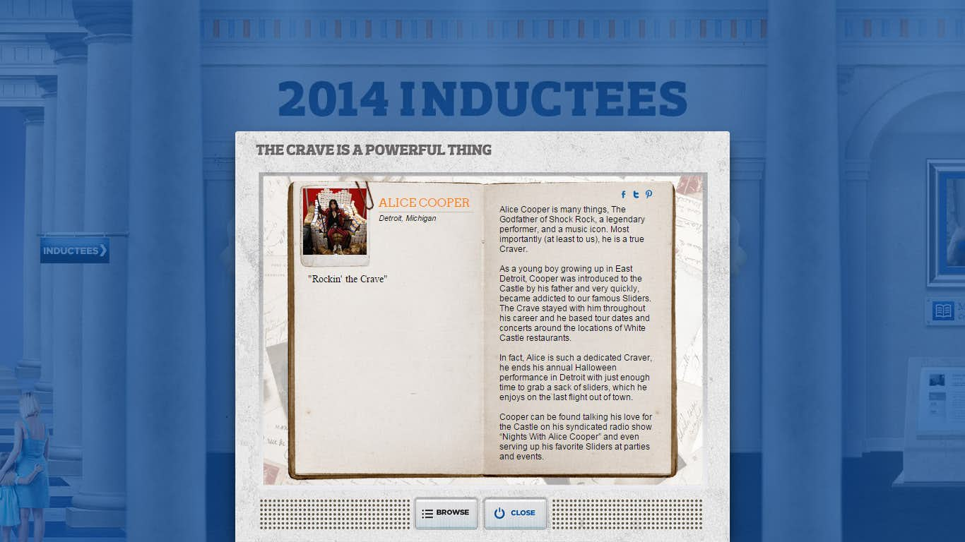
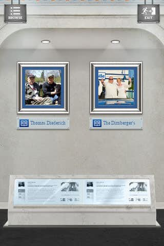
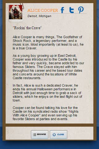
Clicking on a particular inductee will show a book or tome style view of their description and other images or videos that accompany the entry. Browsing year to year can be done from a drop down, or by clicking on the year set in the virtual map.
Mobile
Tower of Crave
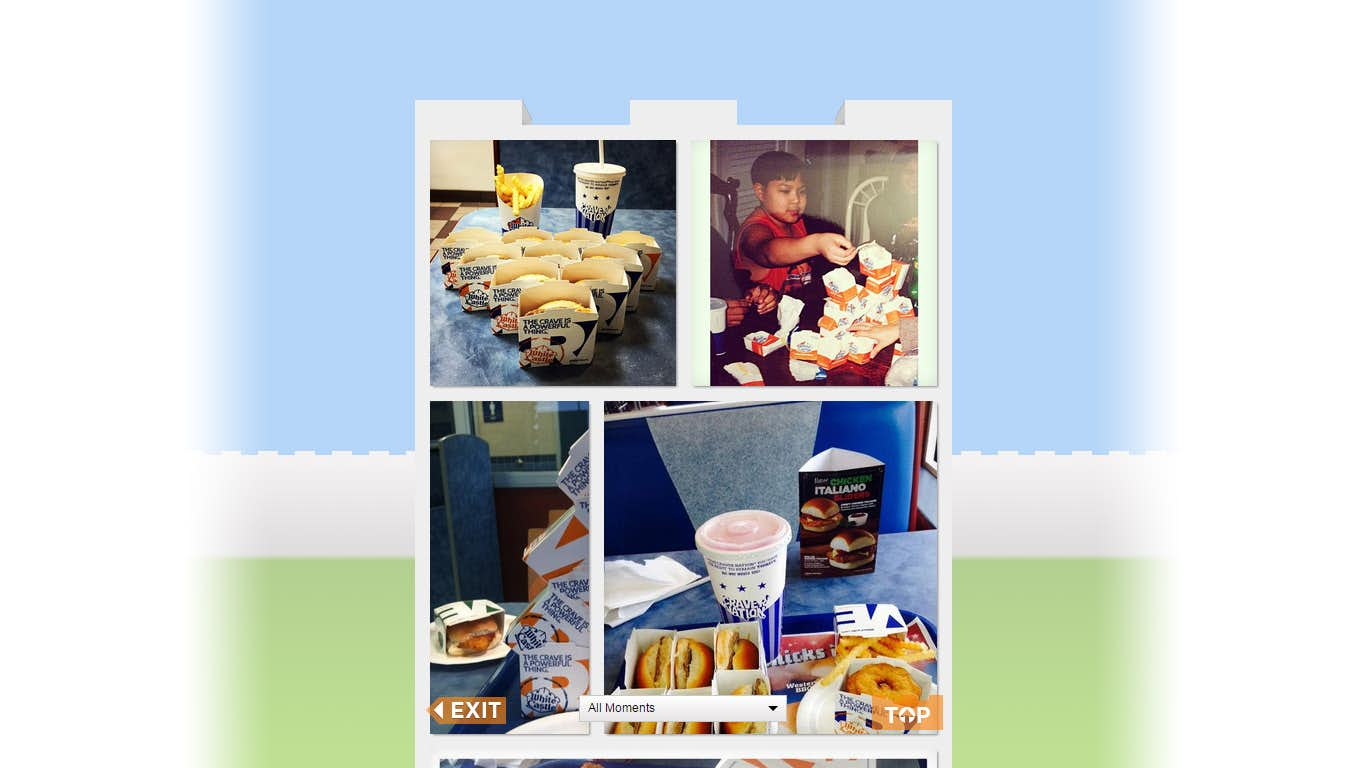
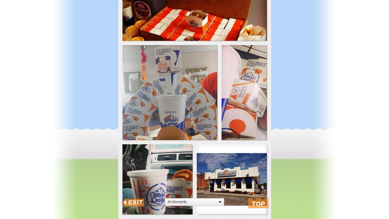
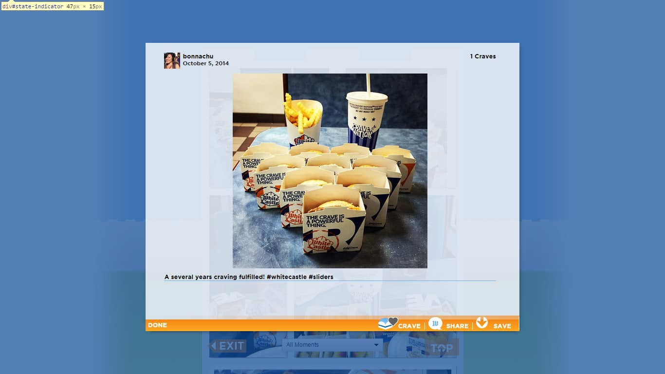
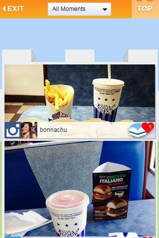
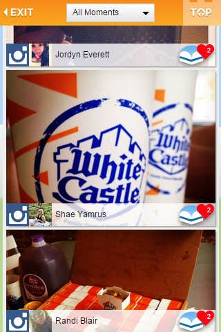
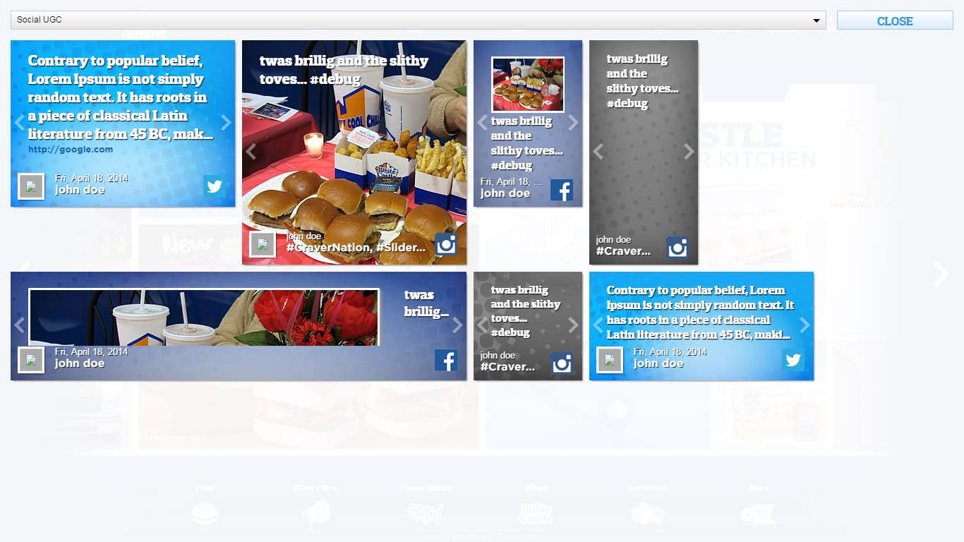
The Tower of Crave is a social UGC based feed that automatically pulls in tweets and Facebook posts for approval in the Admin area. Once approved content will show up on the Tower of Crave ranked by the amount of Craves (likes) by people viewing the feed. Tags can be introduced and filtered allowing WhiteCastle to use the Tower of Crave for varying initiatives and campaigns.
Using Tiles similar to the Wall the Tower of Crave scrolls vertically much like the Wall does when viewed on a mobile platform. The effect is that the user sees higher rated content as one scrolls higher up the Tower. Content can be shared and linked to directly allowing users to get friends involved to rate their content and increase overall engagement.
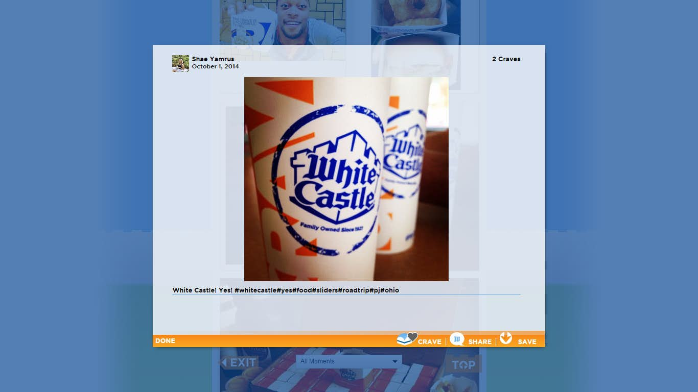
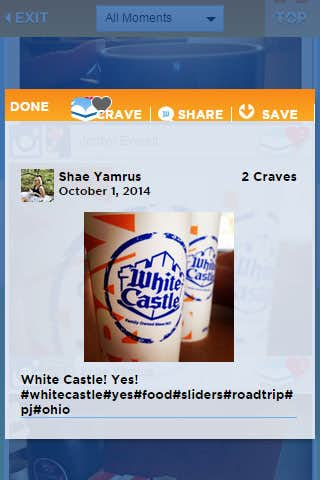
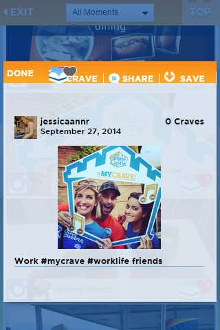
Clicking an individual Tile shows additional information associated with that post such as the user, tags used to pull in that content and a description of the content pulled from the original post.
Mobile
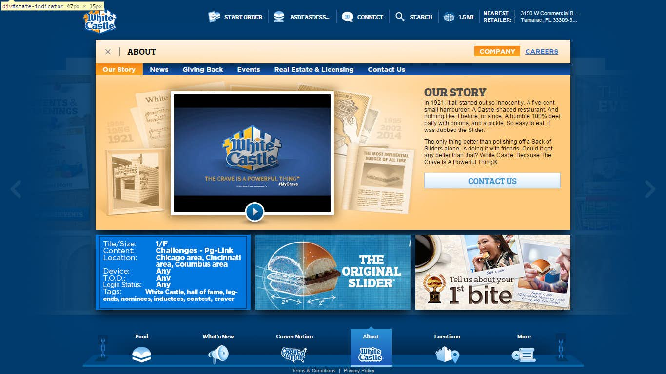
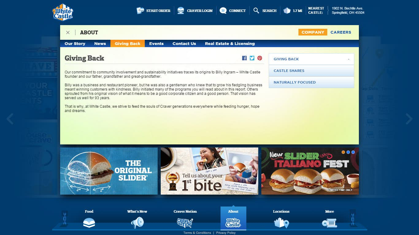
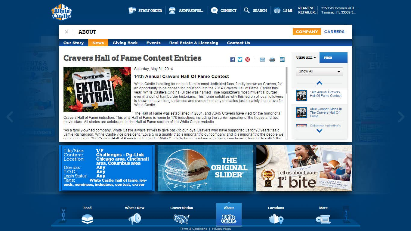
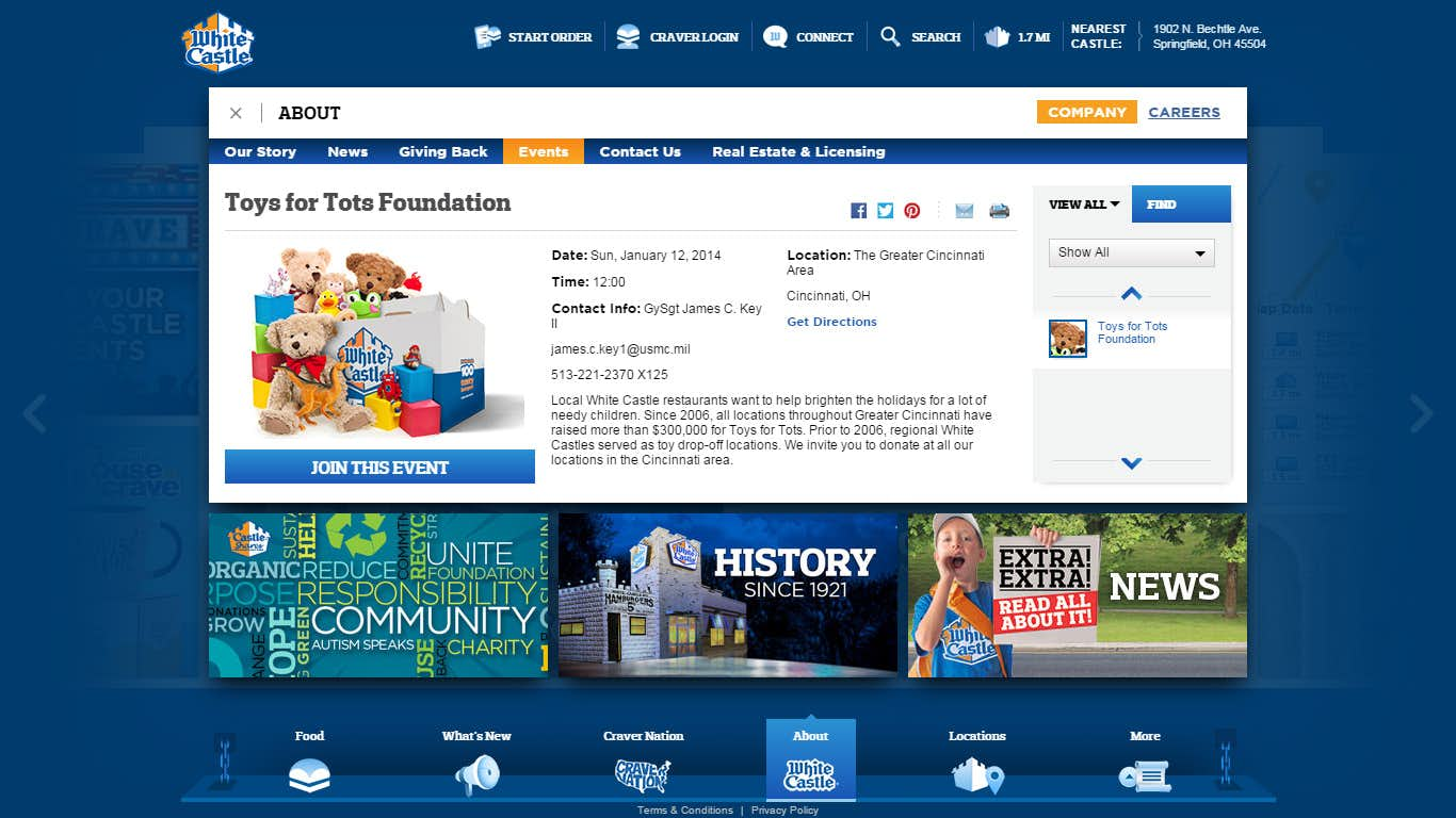
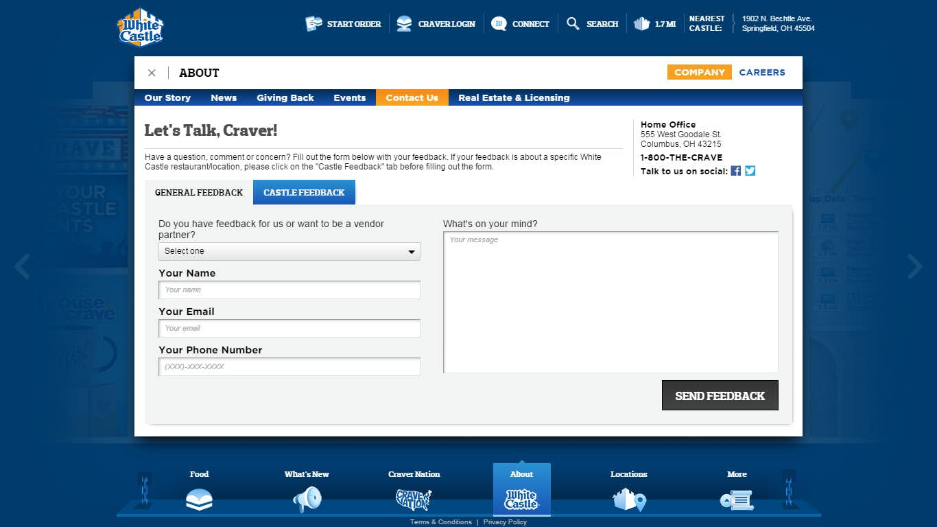
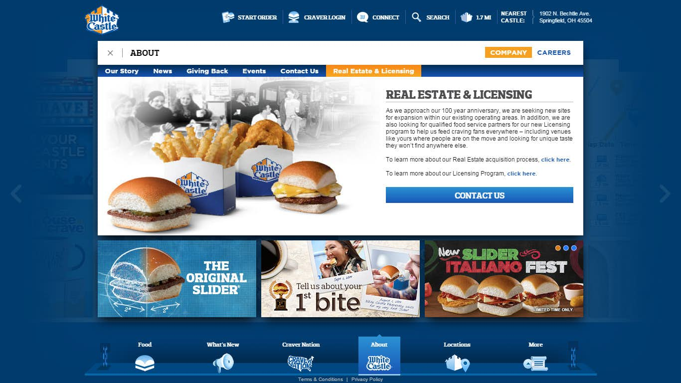
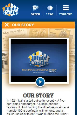
About Us Experience
Mobile
Locations Experience
Mobile
Tiles
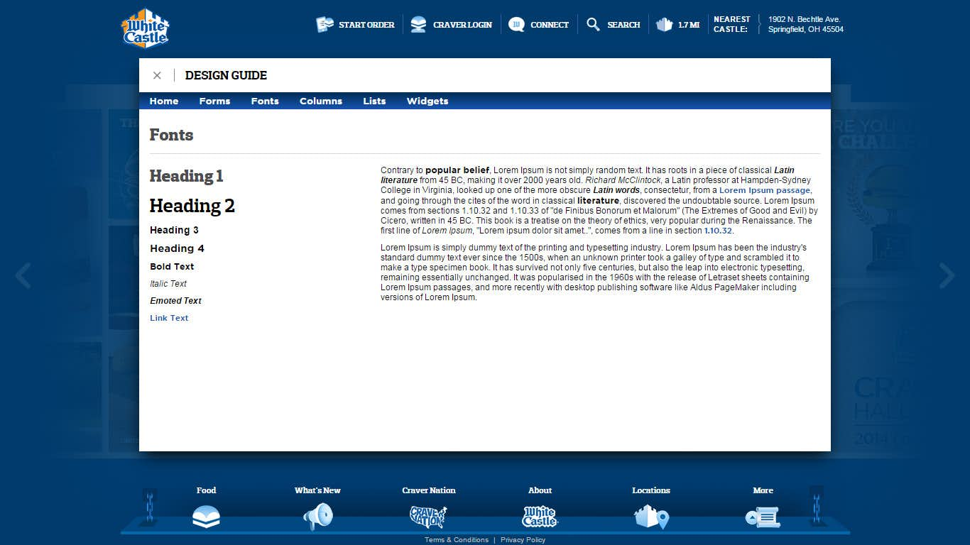
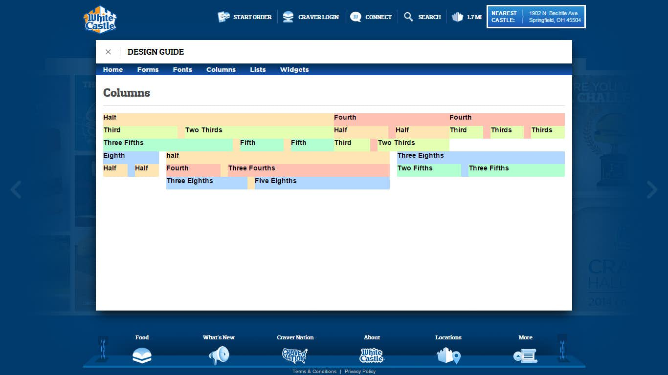
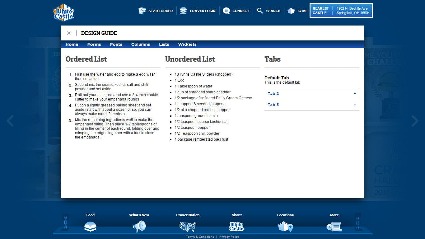
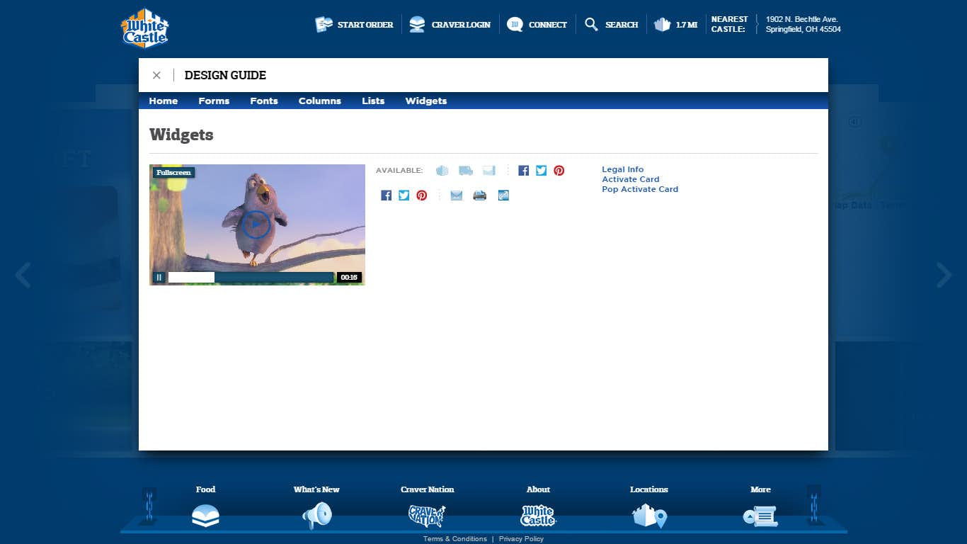
Design Guide
Legal
All trademarks and artwork of the White Castle website are property and copyright of White Castle and Zimmerman Advertising and may not be reproduced in any way for any reason with all rights reserved.
